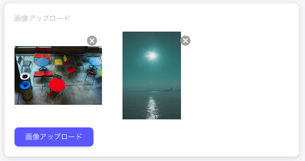
Use MUI to create an image upload component.
- Clicking the image upload button displays the input element standard image selection dialog
- Preview display of single or multiple selected images
- Images are displayed in three columns
- Click on the X button in the top right corner to remove the image from the preview display
The image data configured in this image upload component can be stored on the server by POSTing.
This article describes the process of saving the file to memory on the browser side and displaying a preview.
Source.
In conclusion, implementation can take the following forms
import React from 'react'
import Button from '@mui/material/Button'
import IconButton from '@mui/material/IconButton'
import CancelIcon from '@mui/icons-material/Cancel'
import { Grid } from '@mui/material'

type Props = {
  images: File[]
  setImages: (arg: File[]) => void
}

const FileUploader = (props: Props) => {
  const maxImagesUpload = 10
  const inputId = Math.random().toString(32).substring(2)

  const handleOnAddImage = async (e: React.ChangeEvent<HTMLInputElement>) => {
    if (!e.target.files) return
    const files: File[] = []

    for (const file of e.target.files) {
      files.push(file)
    }

    props.setImages([...props.images, ...files])
    e.target.value = ''
  }

  const handleOnRemoveImage = (index: number) => {
    const newImages = [...props.images]
    newImages.splice(index, 1)
    props.setImages(newImages)
  }

  return (
    <>
      <Grid container spacing={{ xs: 2, md: 3 }} columns={{ xs: 8, sm: 12, md: 12 }}>
        {props.images.map((image, i) => (
          <Grid
            item
            xs={4}
            sm={4}
            md={4}
            key={i}
            sx={{
              display: 'flex',
              justifyContent: 'start',
              alignItems: 'center',
              position: 'relative'
            }}
          >
            <IconButton
              aria-label='delete image'
              style={{
                position: 'absolute',
                top: 10,
                right: 0,
                color: '#aaa'
              }}
              onClick={() => handleOnRemoveImage(i)}
            >
              <CancelIcon />
            </IconButton>
            <img
              src={URL.createObjectURL(image)}
              style={{
                width: '100%',
                height: '100%',
                objectFit: 'contain',
                aspectRatio: '1 / 1'
              }}
              alt=''
            />
          </Grid>
        ))}
      </Grid>
      <label htmlFor={inputId}>
        <Button variant='contained' disabled={props.images.length >= maxImagesUpload} component='span' sx={{ mt: 4 }}>
          Upload Files
        </Button>
        <input
          id={inputId}
          type='file'
          multiple
          accept='image/*,.png,.jpg,.jpeg,.gif'
          onChange={(e: React.ChangeEvent<HTMLInputElement>) => handleOnAddImage(e)}
          style={{ display: 'none' }}
        />
      </label>
    </>
  )
}

export default FileUploader
Define useState in the parent component and pass it to the FileUploader component.
The File added on the FileUploader component side is set on the parent component side to preview the image.
const [images, setImages] = useState<File[]>([])<FileUploader
images={images}
setImages={setImages}
></FileUploader>Explanation.
For ‘Show standard input element image selection dialogue when image upload button is clicked’, simply specify ‘file’ as the type of the input element.
Multiple files can be selected by adding the multiple attribute.
Furthermore, the file extensions that can be selected are narrowed down by accept.
Upon selection, the handleOnAddImage function is called and the images are registered in memory with setImages.
      <label htmlFor={inputId}>
        <Button variant='contained' disabled={props.images.length >= maxImagesUpload} component='span' sx={{ mt: 4 }}>
          Upload Files
        </Button>
        <input
          id={inputId}
          type='file'
          multiple
          accept='image/*,.png,.jpg,.jpeg,.gif'
          onChange={(e: React.ChangeEvent<HTMLInputElement>) => handleOnAddImage(e)}
          style={{ display: 'none' }}
        />
      </label>
When an image is registered in setImages, the component is redrawn, so it is turned in a map and the image is displayed with URL.createObjectURL.
{props.images.map((image, i) => (
  <img src={URL.createObjectURL(image)}/>
))}
In ‘Clicking the X button in the top right corner removes the image from the preview display’, the Index of the clicked image is passed in handleOnRemoveImage to remove it from the memory of images and setimages again.
Summary.
The advantage of using MUI is that the design is simplified and you can concentrate only on the logic aspects.
Image uploading is another area where the handling of the File interface may be confusing, but reading the MDN will help you to understand it easily.