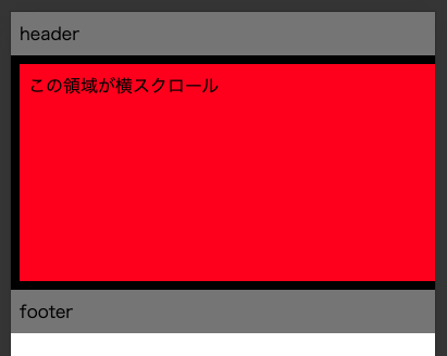
In the previous article, horizontal scrolling was achieved without using overflow, but this resulted in a broken layout when viewed in the Developer Tools or in iOS Safari.

Like this.

Specify viewport.
The solution is to specify the viewport.
<head>
    <meta name="viewport" content="width=device-width, initial-scale=1, minimum-scale=1" />
</head>
This will ensure that the display is exactly the width of the browser.
initial-scale=1
Adding this does not resolve the layout collapse on the developer tools. Why include it?
The setting needs to be added because the layout collapses on iOS Safari when the browser is at standard scale and when the screen transitions to the target page.
minimum-scale=1
In iOS Safari, when using the browser’s standard scale and pinching in after a screen transition to the target page, the layout is adjusted to the maximum screen width and the layout is broken.
Summary
The viewport concept is still not fully organised.
Although minimum-scale is included, the browser’s standard scaling function can be used, so I don’t think it will cause such a big UX degradation when using it.